


In support of a name change, I worked with an internal committee to design a new logo and brand strategy guide for the Bellingham Symphony Orchestra. Characterized by “vibrant, creative, and innovative” qualities paired with “professional and elegant” traits, the brand presents a clean, contemporary yet extensible logo that allows the artistry of the organization to stand for itself.
A comprehensive style guide represents the visual and non-visual brand elements, enabling the client to communicate consistent brand rules and styles.
“The music is not in the notes but in the silence between.”
—Wolfgang Amadeus Mozart
Mozart’s quote is a stunning reflection of music—it drives this brand by focusing not on form but on counterspace, the negative space that surrounds it. Without counterspace, form does not exist and thus holds an equally important role. As an orchestra, it is essential that we play the meaning behind the notes, bringing the music to life and uniting the elements, as well as the brand, wholly together.
[Excerpt from Brand Guide]
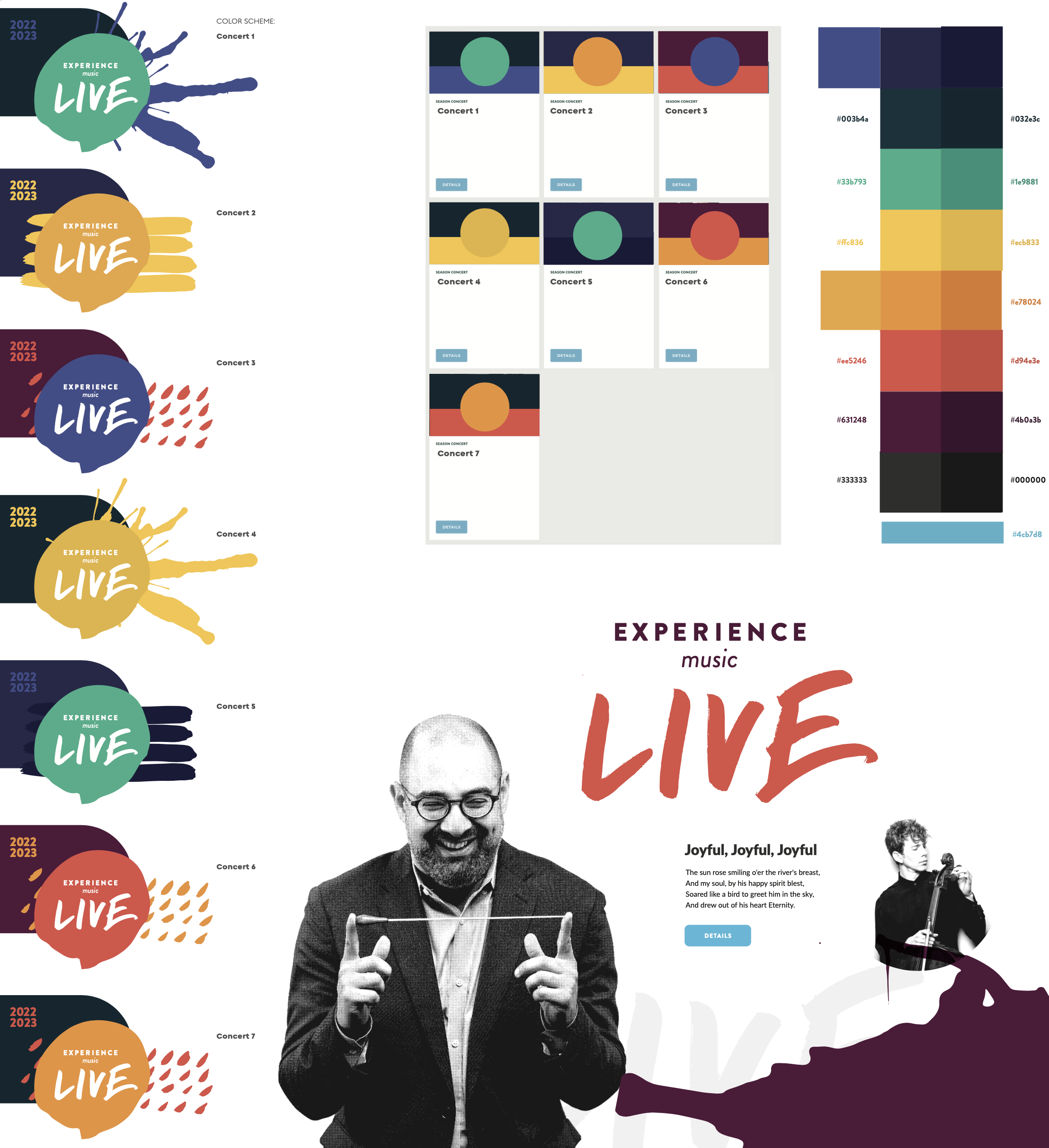
Each year requires a new visual campaign that supports the mission of the season. Creating a look and feel that still feels uniquely BSO is a fascinating challenge.
This season, in the midst of COVID-19, needed a bit of verve and humanity. I intentionally designed a campaign that was full of life and hope, including textures and patterns created at home by the players themselves.